
Building a Scalable Creative System for Celebright.
We scaled Celebright through dealers, but the product only works when it’s installed in real homes, where mistakes don’t stay hidden. Every touchpoint mattered: ad, landing page, quote, install, and referral. One break in that chain shows up directly in consumer trust.
So instead of scaling output, we built systems that scaled consistency.
Overview
Celebright sells permanent outdoor lighting through a growing network of independent dealers. As the network expanded, the brand started to fragment. Dealers were creating their own materials, quality varied, and messaging drifted.
I stepped in to define the visual direction, lead production, and build a system that could scale without losing control.
THE PROBLEM
The issue wasn’t a lack of content. It was a lack of control. Dealers had different levels of marketing ability, brand execution varied widely, content was inconsistent and slow to produce, nothing clearly connected brand to conversion. Growth was actively weakening the brand.
Approach
I moved away from one-off assets and built a pipeline. A system that takes brand decisions and turns them into usable, repeatable marketing, without relying on every dealer to “figure it out.”
Defining the Brand
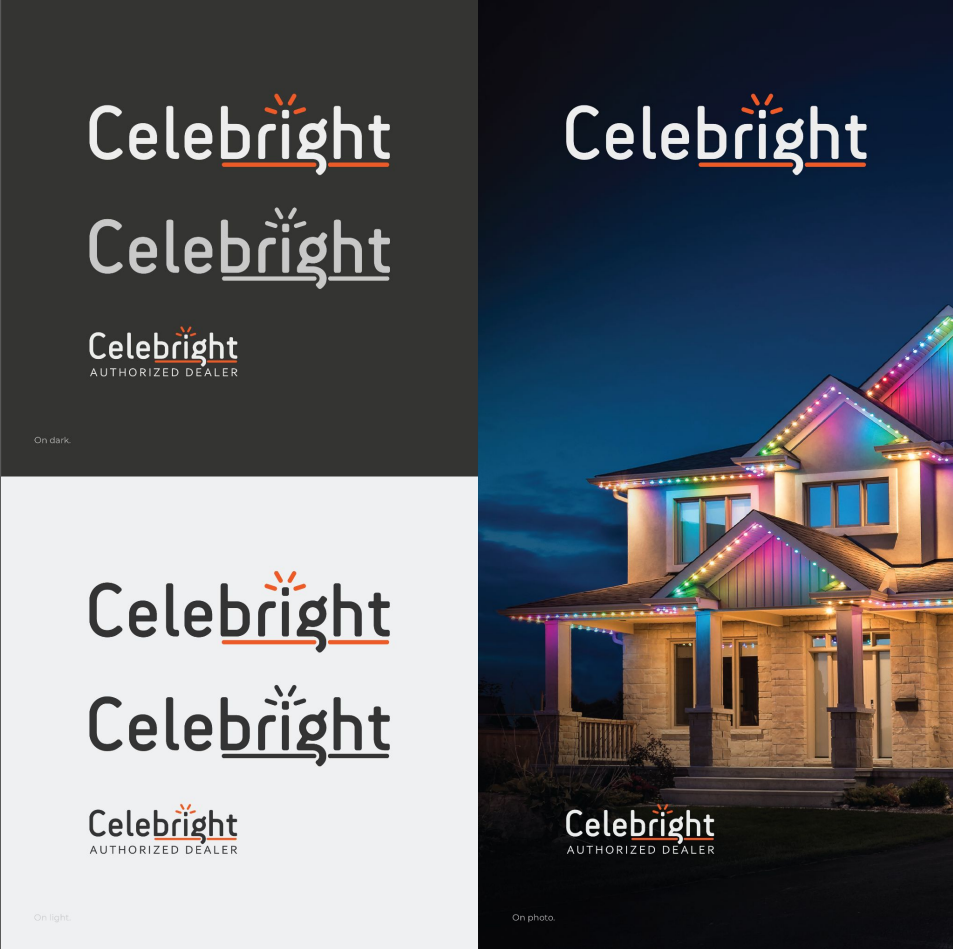
Locked in visual rules and messaging so decisions weren’t subjective.
The Celebright brand guidelines are a valuable tool for maintaining consistent and clear communication. It provides writing, formatting, and visual convention guidelines across various communication channels. Additionally, it establishes specific fonts and colors to ensure a cohesive and visually appealing brand identity.
This is a guideline and not a rulebook, our brand must stay consistent but flexible.
Motion by 1px
At Celebright, the product became the medium. Each install acted like a one-pixel display wrapped around the architecture itself: eaves, gutters, and rooflines. Instead of designing for a traditional screen format like 1080×1920, the system worked more like a long 1×469 display stretched across a home. That limitation shaped the entire visual language. Animations had to communicate through timing, spacing, movement, and color rather than detail-heavy graphics. The goal was to create motion that could be understood quickly from the street, through a windshield, or while walking past.
Seasonal campaigns turned that single line into a storytelling surface. Familiar holiday scenes were rebuilt using only movement along the roofline. In one sequence, a red pixel led the path while eight white reindeer followed behind, with Santa trailing in a green sleigh. Each element entered the line one after another, creating the feeling of a moving parade circling the house. Because the system was so minimal, every pixel mattered. The motion had to stay clear and readable while still feeling playful and alive.
The logo reveal followed the same thinking. The logo itself stayed simple, while the animated underline carried the personality of the system. Instead of locking the line to a single orange brand color, it was designed to shift anywhere across the RGB spectrum, just like the lights themselves. That connection tied the branding directly back to the product. The underline could load different presets, themes, and color combinations from the app, turning the identity into a live extension of the lighting system instead of a static graphic.
Direct the Core Content
Created key assets designed to do specific jobs in the funnel.
INSTALL VIDEO
Install videos carried the final layer of trust. They showed process, professionalism, and real installation quality in actual homes. This reduced perceived risk at the point where customers typically hesitate before booking.
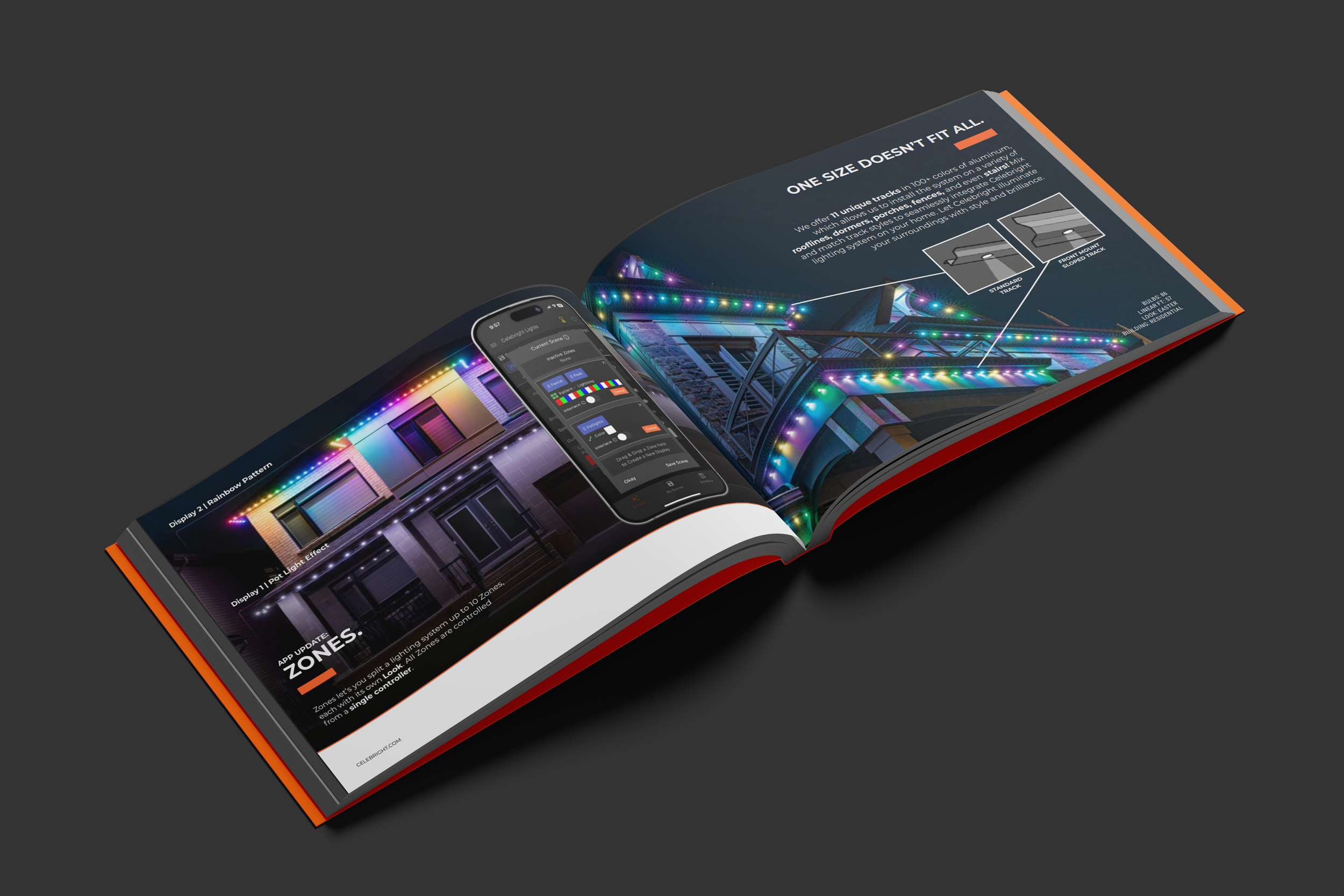
Look book
Look books provided structured proof once interest was established. They showed range, finishes, and real installations in context, helping people visualize the product on their own home and reducing uncertainty.

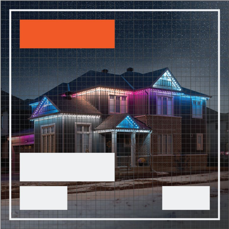
Ads
Ads were built to interrupt and create interest. They were short, clear, and focused on transformation, showing the difference a home lighting install makes. Along with system updates for costumers and knowledge for interested parties.
Align to Conversion
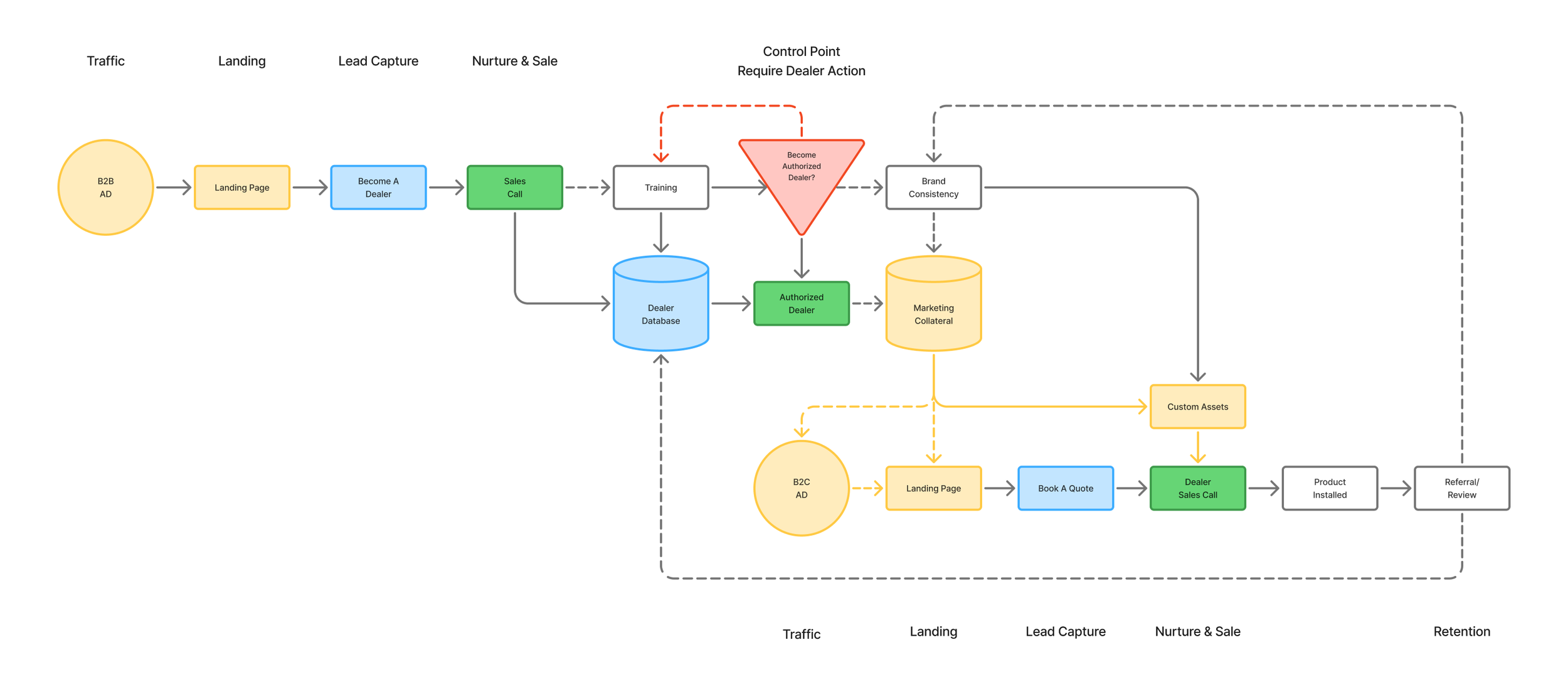
Authorization as a quality gate.
Becoming an authorized dealer wasn’t just access, it was validation. Dealers needed the fundamentals: a functioning business, a brand identity, and the ability to represent the product in the field. If that wasn’t in place, they didn’t move forward. We weren’t optimizing for volume. We were protecting outcomes.
We scaled Celebright through dealers, but because installs happen on real homes, consistency mattered at every step. From ad to install to referral. So we built shared funnels, centralized dealer info, and ready-to-use marketing assets instead of ad-hoc materials. Authorization acted as a quality gate, ensuring dealers could properly represent the brand before going live. Once approved, they got a unified system of branding and collateral, with light regional flexibility, so the customer experience stayed consistent while still adapting to local needs, while the feedback loop of reviews and referrals kept tightening the standard over time.
SYSTEMIZE PRODUCTION
Turned content into something repeatable.
Less reinventing. More consistency.
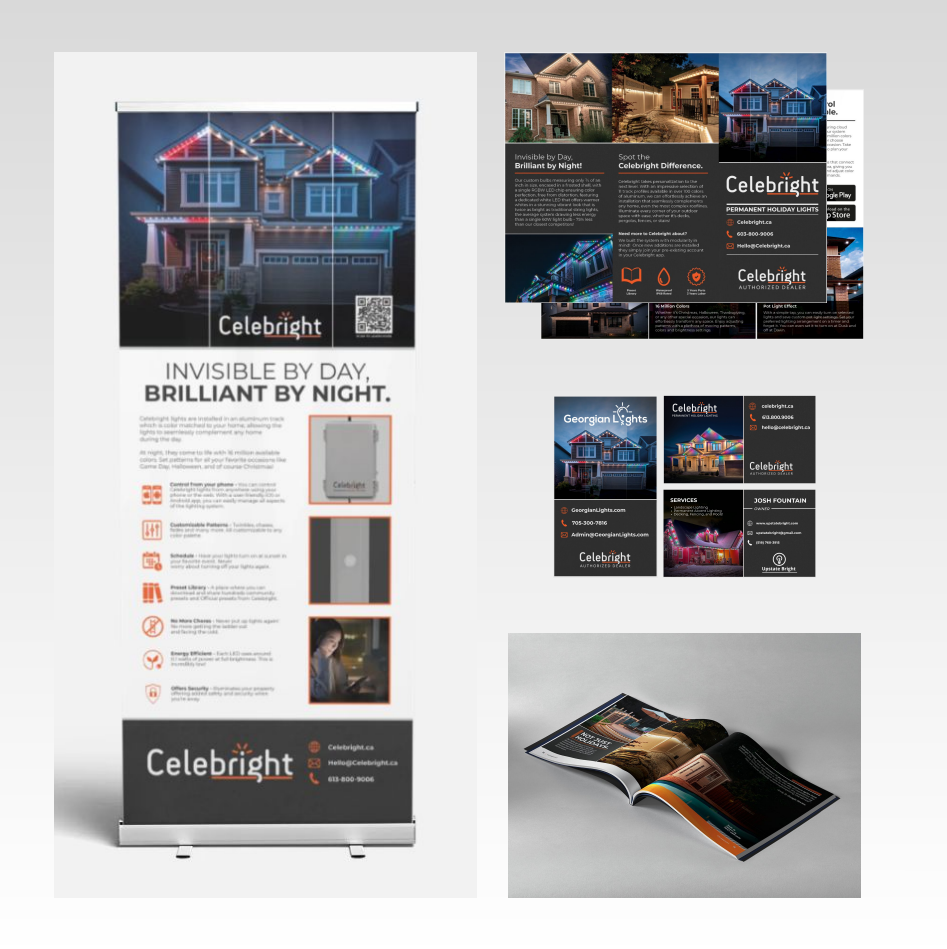
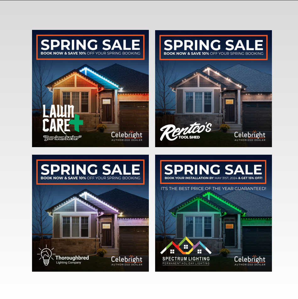
Templates instead of one-offsWe replaced ad-hoc marketing with a templated system built for speed and control. Dealers were no longer creating materials from scratch or improvising under pressure.
Everything was standardized and ready to deploy: trade show banners, brochures, business cards, truck decals, spec sheets, email campaigns, and social posts.
Each pre-built, branded, and customizable. The goal wasn’t more content. It was less variation.
Modular formatsEvery asset was built on a modular design system tuned for real-world use across print, web, and social.
Aspect ratios, safe zones, cropping behavior, and bounding boxes were defined upfront so nothing critical got lost in platform compression or misuse.
Brand placement, Celebright identity, and dealer information were locked into predictable positions.
Once a dealer was authorized, an automated system could assemble complete marketing packages by combining: dealer logo + dealer info + approved templates.
No manual design decisions required.
Scalable workflowsThe modular system also created a scalable workflow internally. With templates, branding, and messaging standardized across markets, the team could focus on larger initiatives knowing the core marketing foundation was already covered. Regional flexibility was still built in allowing creative to adapt for different climates, lifestyles, and customer markets without losing overall brand consistency.
outcome
Brand consistency held as the network scaled.
Dealers relied less on custom content. Production became faster, more predictable, and easier to repeat. Marketing stopped being a bottleneck and started becoming infrastructure. Creative decisions were tied directly to conversion instead of preference or improvisation. The system reduced noise and increased trust across every market.
personal reflection
The challenge was producing good content and keeping it good across dozens of hands, environments, and edge cases. The system isn’t finished. There’s still room to tighten feedback loops between dealer performance and creative iteration. But the foundation works: controlled output, clear structure, and a workflow that scales without breaking brand integrity.